|
For this part of the project we were suppose to vectorize three of our logos, and make three variations of them. I was bored, so I actually vectorized more than three logos and made some adjustments to some of the logos. The picture below shows my final three logos with their different variations. The most frustrating thing about this whole process was that I needed to choose just three logos and then the final official logo for the brand. Vectorizing, coloring, and making the logos was probably the most fun and favorite part of the whole logo designing. This process taught me that I need to make choices, and that vectorizing logos don’t always go your way. 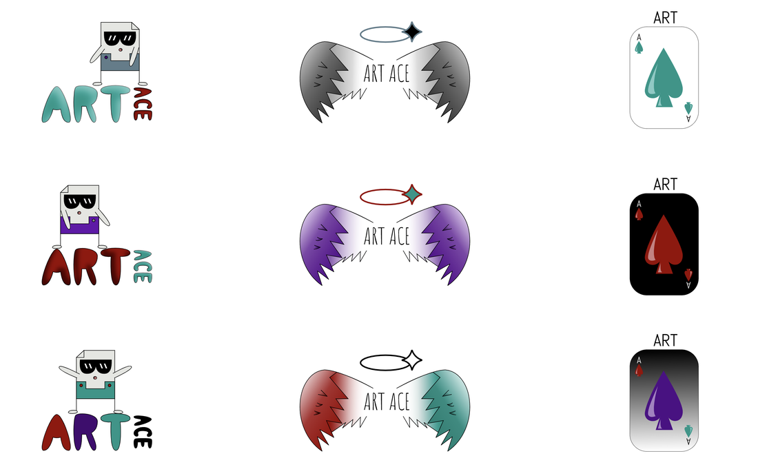 The name of the brand I made is Art Ace (aka A^2). Art Ace is a site where you post drawings or anything art related and get feedback or encouragements from other artists. Also, the art you post doesn’t need to be a drawing but could be a story or 3D model you made. Art Ace is a place where people can express their creativity without people’s opinions. It is a place to explore different types of art and opens up ways to improve on your work. The logo I choose represents the brand the best in my opinion. The design is artistic as well as colorful and fun. Choosing just one logo was really hard; however, I believe that the logo I choose represents the brand well and fully. This is because the character at the top of the logo is just fun and excited which represents the brand. However, art wise, I believe that I would have chosen a different logo, but the logo I would have chosen was not representing the brand in the way I wanted the people to see it. Thus, I choose the logo below. Comments are closed.
|
Archives
April 2020
Categories
All
 This work is licensed under a Creative Commons Attribution-NonCommercial-NoDerivatives 4.0 International License. |
