|
This time on Gravit, we did two assignments. The first one was to get at least 15 colors and name the RGB value and the HEX code. The second one was to explore this website called Adobe Color and use it to make four different schemes. For the first project, I thought to make a palette with different colors and name all the color with lines. It was fun using the Pen tool to make the paint splatters. It was kind of annoying how I needed to check every color for the values. For the second project, I didn't know what to do, so I made a bowl which inspired me to make bowls which contained paint and a paintbrush in each one. All in all, I am proud of my work, especially for the Color Names project because of the colors. ^^ Color Names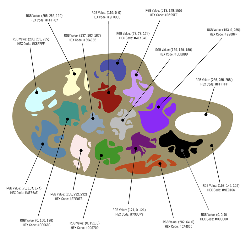 Color Schemes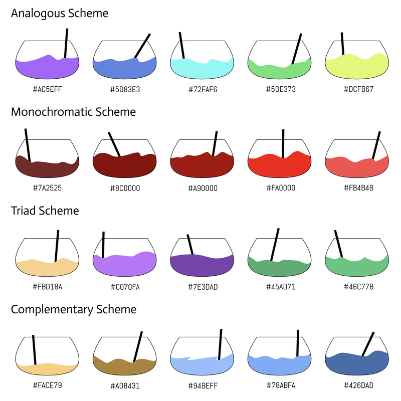 Typography is the visual component of a written word. Typography is important because the better typography you have the more people will be interested in the material. People, these days, actually judge a book by the cover, so if you have eye catching typography, then people will be more likely to buy the book. Also, good typography reinforces the meaning of the text. The quote, "Each font has a personality and purpose" means that each font is created to be used in a certain place. If used wrongly, the font can ruin the meaning of the text. For example, if goofy font is used for a hospital, it will feel like the hospital is goofy and not serious. To avoid that, there are 5 different types of fonts:
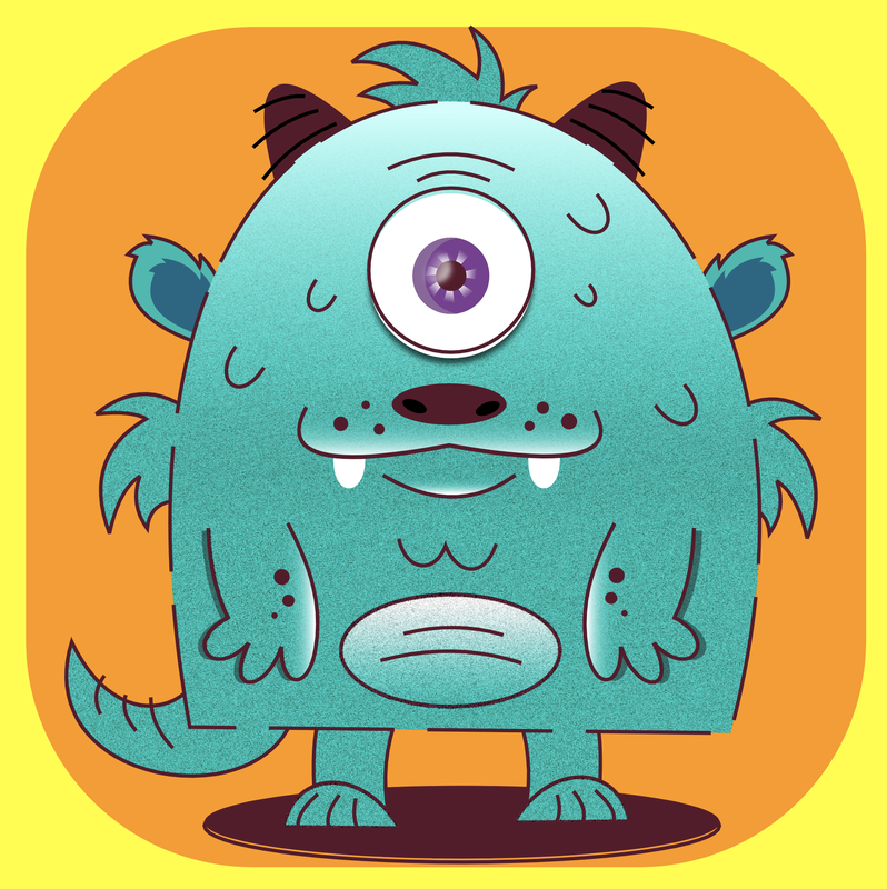
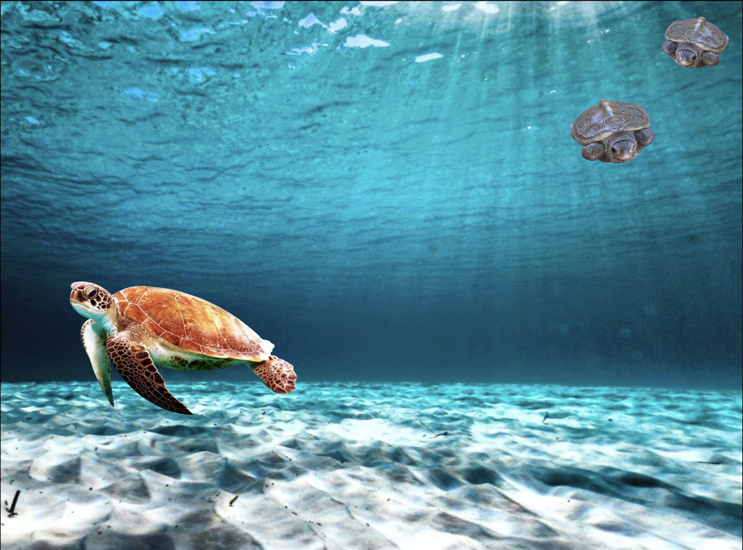
Typeface ComparisonIn this assignment, I was suppose to explore the 5 different fonts and chose one font for each font type. So, I made a title of the type of font and below the font name. Then, I wrote "Who are you?" in that font. 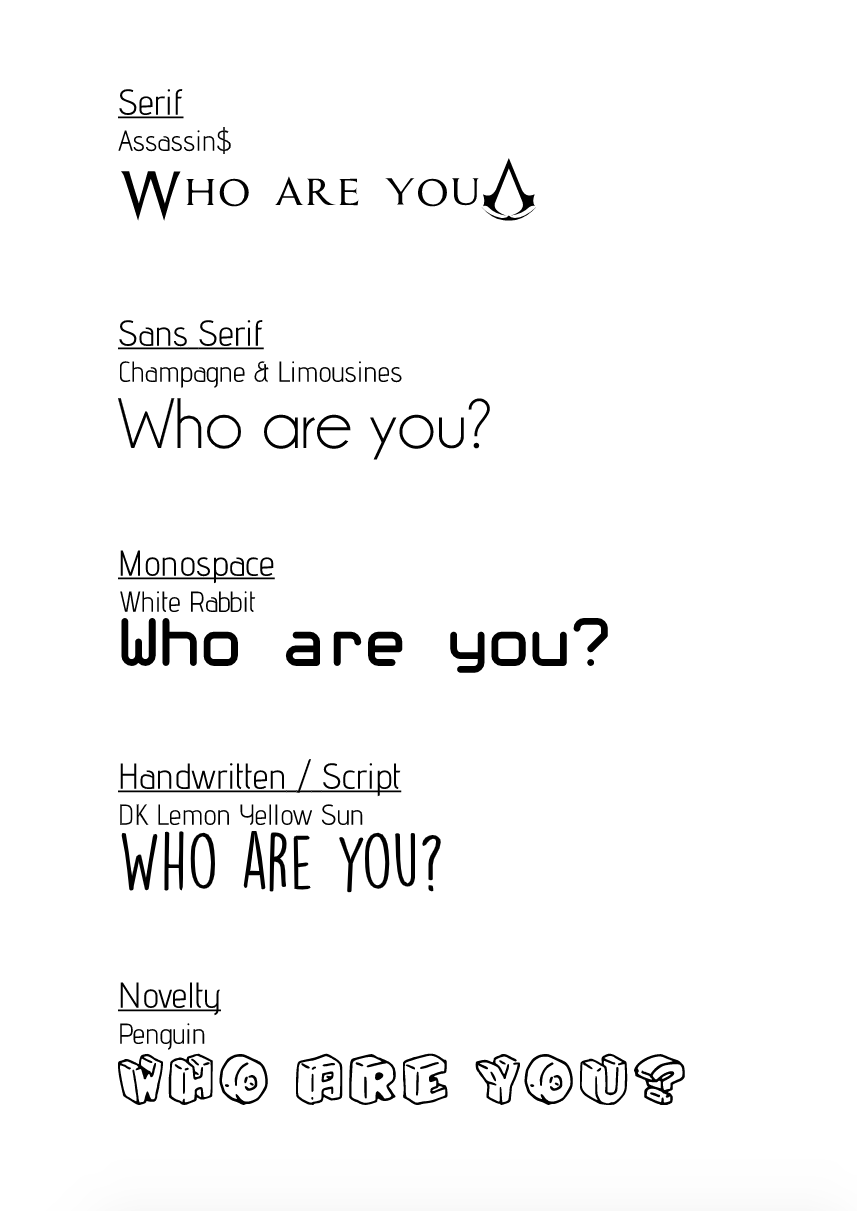 Word PortraitsIn this assignment, I was suppose to explore each font's "personality" and chose 10 fonts. For each font, I was suppose to write the vibe the font was giving and what the font wasn't giving. I wrote the wrong vibe of the font on the left, and on the right I wrote the vibe the font was giving. I also wrote the font name above the two words and chose 10 different fonts. 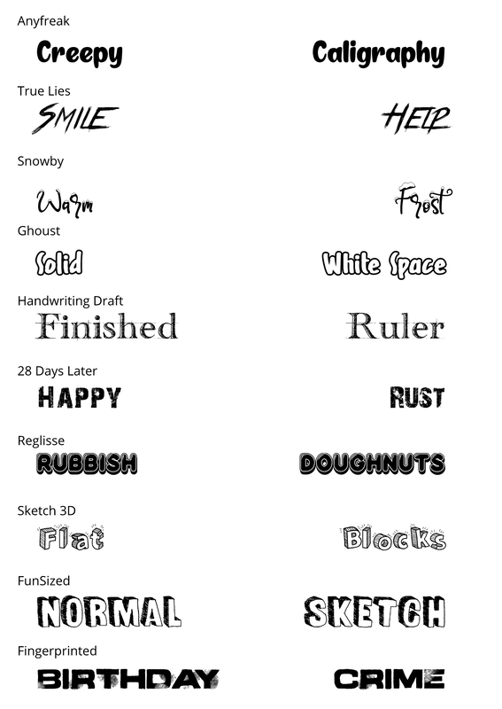 The images below are the assignments my teacher gave me. She want the class to follow the instructions for the first image below to get used to the Pen Tool on Gravit. The Pen Tool is a tool you can use to trace out images or just draw in general. The Penny cutout of Abraham Lincoln was to apply our skill of the Pen Tool to trace out Lincoln. The Monster picture beside the Penny cutout was just an optional challenge. The final piece is a composite picture of 2 different types of turtles on an ocean background which I got from the Internet. The whole process was actually easier than I thought, but the hardest thing to do was continuously holding the mouse key to make changes like pressing the alt key or continuing to press down while moving the mouse to make the wanted changes. 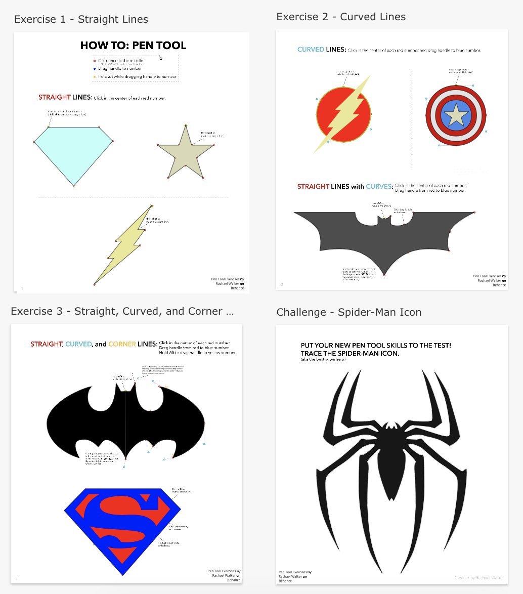
 The scene below is a beach. Beaches usually have palm trees, umbrellas, starfish, turtles, and beach balls. Beaches are special to me because they calm me down. Also, you can maybe see turtles, which are one of my favorite animals, there. I like turtles because they're slow physically kind of like me, but they still have a talent for swimming in the water. The beach is also fun to go to. 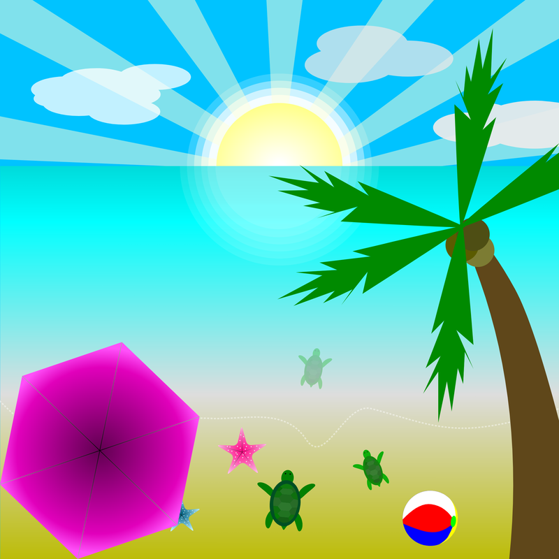 On Gravit, I learned to make compound shapes by unifying, subtracting, cutting out the differences, and cutting off the overlapping parts of the shape. I also learned to smooth borders and change the number of points. 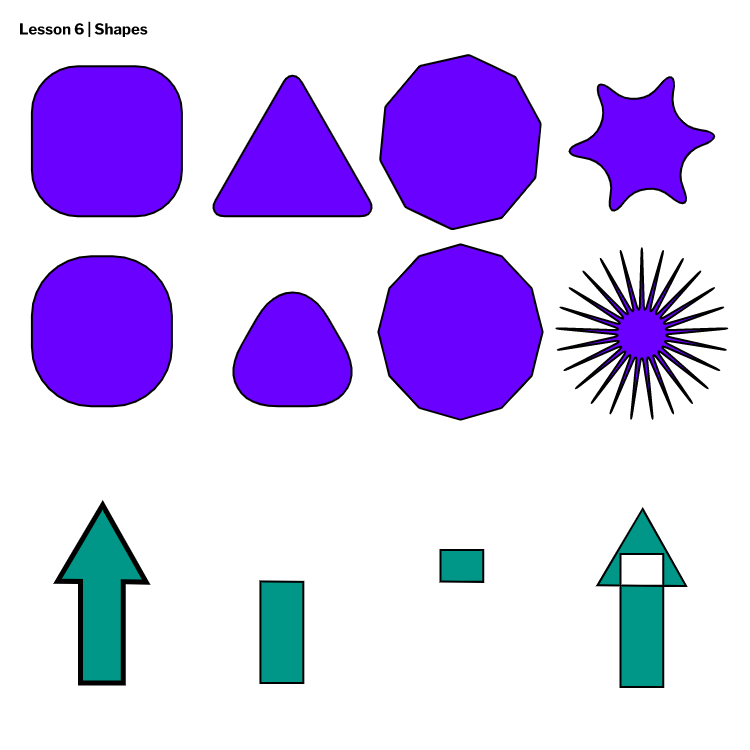 This time on Gravit I didn't really learn much, but I did learned to align and equally distribute shapes on Gravit. 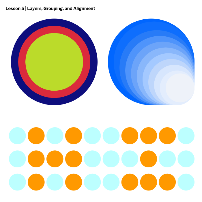 This time on Gravit, I learned to change the borders and fill. Since I know more about fills than borders, I didn't learned anything about fills in Gravit. I learned how to create dash border lines, to change the corners., and to align borders. 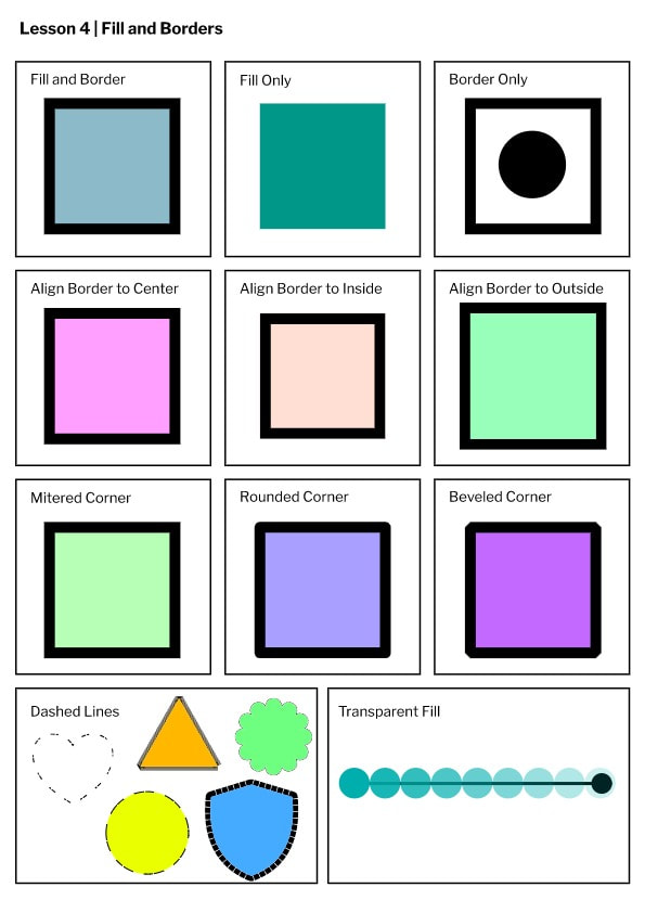 Through this activity, I learned to modify the anchor points of circles and rectangles through the sub-select tool in Gravit. I also learned to use the shift button to make everything in Gravit straighter.  I learned how to use Gravit. Gravit is a website for creating vector images (images that are not made up of pixels). In Gravit, you can create logos, T-shirts, brands, etc.  I have some experience with graphic design through my technology class at my school. I think I'm pretty good at organizing my work and the art part of graphic design. On the bottom is an example of a menu project we did during technology class.  |
Archives
April 2020
Categories
All
 This work is licensed under a Creative Commons Attribution-NonCommercial-NoDerivatives 4.0 International License. |